You can also add the show’s RSS feed to your podcast app to follow us directly.
Robinson Meyer:
It’s Wednesday, September 30th, and this is a special New York Climate Week edition of Shift Key. Last week, Heatmap welcomed climate and energy leaders, experts, and influencers to Heatmap House, our all-day summit in New York City. Among those leaders was former Vice President Al Gore. Vice President Gore needs no introduction. He is, in a way, the original climate influencer. His film, An Inconvenient Truth, gave rise to a new wave of climate activism in the 2000s. It was one of the highest-grossing documentaries of all time when it was released, and it won an Oscar, a Grammy, and, for Vice President Gore, a Nobel Peace Prize. Of course, Gore has remained active in climate policy since then. At the time of our conversation, he’d just returned from Asia, where he was training a new cohort of leaders for his Climate Reality Project. Our conversation came on the 20th anniversary of An Inconvenient Truth. We discussed that film’s legacy, what’s changed since its release, what surprised the vice president the most, and his perhaps surprising thoughts on artificial intelligence. Let’s go to the show. I’m Robinson Meyer, the founding executive editor of Heatmap News. This conversation was recorded in front of a live audience at Heatmap House at 22 Vanderbilt in New York City on September 23rd. It’s all coming up on Shift Key.
Robinson Meyer:
Vice President Gore!
Al Gore:
Robinson Meyer!
Robinson Meyer:
It’s so good to have you here. Thank you for joining us.
Al Gore:
Great to be here. Thank you for doing the interview.
Robinson Meyer:
Of course. We wanted to have you at Heatmap House for a long time. I know I said this backstage, but thank you so much for joining us. We really appreciate your time.
Al Gore:
Thank you for what you and your colleagues are doing at Heatmap. It’s just an amazing organization.
Robinson Meyer:
So I wanted to start — I have questions, and we will get to them — but I wanted to start by asking how you’re feeling today. It is September 23rd, 2026. It’s been quite a few years. How are you feeling about the climate challenge, about American politics? What’s going on in your heart at the moment?
Al Gore:
Well, those two things are related, of course. But I’m temperamentally optimistic, and I’m specifically optimistic that we are going to solve the climate crisis. We are going to win this. The remaining question is whether we will win it in time to avoid crossing some of these very dangerous negative tipping points: the Gulf Stream, the Amazon flipping into savanna, the ice melt to pace. Greenland is losing 30 million tons of ice every hour right now. But I have an image that, to me, conveys what’s going on in the big picture. I see a very big wheel turning powerfully in the right direction, and inside it, little wheels turning in the opposite direction, but the overall momentum is extremely powerful. I would even say, Robinson, that there is a possibility that we will, in the future, look back on this year of 2026 as the positive tipping point on climate. I say that for a number of reasons. This is the first year that the production of energy from renewable sources has exceeded the overall increase in global energy demand. Some tipping points are rounded at the top; this may be a plateau. But if you look back 20 years, there were virtually no electric vehicles at all, maybe a couple of thousand sold. In 2010, 7,000 EVs were sold worldwide. This year, by the end of the year, 30% of all new cars sold globally will be EVs. Already last month, it was 65% in China, on the way to 82% in the next three or four years. If you look at electric power generation, last year, as you know very well, 86% of all the new capacity installed worldwide was renewable. And here in the U.S., in spite of Donald Trump, it was 92%. 91% — you add rooftop solar, 93% was renewable. If you look at investment, I’ve been saying there’s twice as much investment in renewables as in fossil fuels. Fatih Birol at the IEA is saying it’s almost three times as much now. Twenty years ago, 77% of all electricity was fossil. Now it’s down to a quarter.
Robinson Meyer:
Yeah.
Al Gore:
And there are other similar statistics. I think this movement, which has become the largest grassroots movement in the history of the world, is unstoppable. But it’s the pace, and it’s the fierce resistance, organized and massively funded by the fossil fuel industry, which makes the East India Company look like a popcorn salesman. They’ve achieved hegemonic control of all the policy verticals that affect their attenuating business plan. But we are winning. We need to win faster.
Robinson Meyer:
Let’s start by talking about 20 years ago, because 20 years ago, An Inconvenient Truth came out. I recently had cause to revisit the film, and I actually have to confess something. I was very excited when the movie came out, but I don’t think I’ve ever admitted this, and maybe this is the wrong audience to do it to: I was too stressed about climate change to actually watch it. Not that it was a daily anxiety, but I was like, “I can’t. There’s so many other things.” And so I actually watched it for the first time only recently. I had the book, let’s be clear. I had the book.
Al Gore:
A limited confession.
Robinson Meyer:
Yeah, yeah. It was so fascinating watching it 20 years on, because there are some sections of it that I think you could give today. Not that little has changed — the science hasn’t, of course — but the way people think about it, the way people move from denial to doom, hasn’t changed in some ways. I wondered what surprised you most about the intervening 20 years since the film came out. It received a response that, I don’t know what you were anticipating, but it was certainly on a scale beyond what was expected at the time. And then there’s where we are today.
Al Gore:
Well, when Laurie David first made the suggestion, here in this city, I gave an early version of my slideshow when we were promoting that movie. What was it, The Day After —
Robinson Meyer:
The Day After Tomorrow?
Al Gore:
The Day After Tomorrow. Was that it? Yeah. And they said, “Well, that’s fiction, isn’t it?” And I said, “Well, it’s not as fictional as the then-current administration was about climate.” But when she said, “This needs to be made into a movie,” I said, “You’re crazy.” As one of the early previewers said, “Al Gore giving a slideshow — what part of that doesn’t scream hit?” So I was a skeptic about the enterprise, and I was surprised at the reception it got. Really, the credit belongs to the scientists I was just channeling. The fact that everything they predicted has proven to be basically spot on is a credit to them. For the rest of us, the fact that they were so right then should cause us to pay more attention to what they’re warning us about now. As for what has surprised me, it’s the ferocity and durability and massive continued financing of climate denial by the fossil fuel industry. There was a time during these last 20 years when they said they were going to be part of the solution, and a couple of them made some good-faith efforts in that direction. But then, like Steve Martin on the old SNL, they went, “Nah.” They decided just to give up the ghost and go full speed ahead on more and more fossil fuels. I think they’re losing as we are winning, but they’re hanging in there.
Robinson Meyer:
Why do you think they — ? Since 2006, we’ve seen almost two cycles of climate policymaking in the U.S. There was the first Obama administration, when we didn’t get cap and trade, but the EPA regulations eventually came out, the car structure —
Al Gore:
And the Paris Agreement.
Robinson Meyer:
And the Paris Agreement, of course. And then the first Trump administration, and then the IRA, which I want to talk about in a second. But during that time, fossil fuel companies did make this move, as you said, toward at least appearing to be part of the solution, and then they backed off. What do you think caused them to back off? Was it a lack of subject-area expertise? Was it that, at the time, the technologies weren’t as profitable as their fuels, and they needed to fit into an investment mix in which they are always supplying this kind of outsized fossil fuel profitability?
Al Gore:
Well, I think it’s been, in some ways, the tyranny of short-term profits taking over their business model. And in order to solve the climate crisis, we’re going to have to pay attention to the democracy crisis. The compound ideology of democratic capitalism has served us well in many respects, but when the Berlin Wall came down and communism collapsed, there was a surge of triumphalism in the capitalist part of that sphere. Something similar happened when the fossil fuel companies faced pressure. You could earn a little bit more in the short term if you just went faster on fossil fuels. But something interesting has happened this year, and this is another reason why I think there’s a real possibility of a positive tipping point. I hate to turn my back on you guys over here. The war in Iran marks the second time in four years that the fossil fuel supply chain has been disrupted, and price volatility has returned. People around the world have reacted to this in a really dramatic way. In the last six months, 50 countries have doubled their share of EVs in their fleet. We saw the president of Korea say, and I’m paraphrasing, “This shows us we have got to speed up this transition away from fossil fuels.” Thailand just announced a big shift from LNG to solar. In Africa, where they were really not participating in the solar revolution a few years ago, they’re now installing 100,000 panels per day. These are signs that this thing is really moving into high gear.
Robinson Meyer:
I think it’s undercut the idea that fossil fuels, especially for countries without fossil fuel resources domestically, are a long-term, secure investment in your energy security. They’re not.
Al Gore:
Yeah. Look at their three —
Robinson Meyer:
Or at least oil and gas. I think coal is going to be a whole other problem.
Al Gore:
Yeah. Twenty years ago, the U.S. got 49% of its electricity from coal. Today, that’s down to 16%. Mike Bloomberg and the Sierra Club deserve a lot of the credit for that. But when I say the fossil fuel industry is losing, they know they’re losing, and they’re trying to slow down how quickly they lose. If you look at their three biggest markets, power generation is number one, and as I’ve already said, with 86% of all the new build last year being renewables, they’re losing that. Transportation is their second biggest source. The internal combustion engine peaked nine years ago, and since 2017, sales have gone down 25%, while EV sales have gone up 1,500%. Their third market is petrochemicals, which is now actually driving the oil part of the market, because 75% of petrochemicals is plastics. They’re projecting a tripling of plastics production by 2035. How’s that going to work for the rest of us, when microplastics are already in our bodies? In the oceans, the rivers, the roadsides. That’s why the fossil fuel companies have been so energetic in tearing apart the UN negotiations on a plastics treaty, and why they’ve blown up the shipping treaty negotiations. Forty percent of all shipping in the entire world, by mass, is lugging fossil fuels around. They see these trends, and they’re desperately telling their bigger, long-term investors, “Stay with us. Please stay with us.” They’re screaming about capital availability. I think they’re really desperate, and that’s why they’ve pulled out all the stops.
Robinson Meyer:
The destruction of the shipping treaty was interesting, because it was not merely anonymous fossil fuel actors. It was the Trump administration coming in and specifically blowing up those negotiations.
Al Gore:
Well, he told them during the campaign, very famously. One of his jujitsu superpowers is saying the corrupt part out loud, so people think, “Well, he said it publicly. It couldn’t be corrupt.” He’s by far the most corrupt president in all of history. And he said to the fossil fuel executives at Mar-a-Lago, you know the video, “Give me a billion dollars, and I’ll do whatever you want.” That transaction was made, and he’s following through on it.
Robinson Meyer:
What do you make of the fate of the Inflation Reduction Act? For those of us who were involved in climate, especially in the late 2010s, there was a feeling that climate should be a bigger part of politics and a bigger part of the Democratic Party’s policymaking agenda. And then a Democratic president did that. President Biden’s reconciliation bill was the IRA. I can’t say the electorate responded in an overwhelmingly positive way, and then, of course, the Trump administration has repealed aspects of the bill. So what did you make of this broader saga, where climate finally became a topic of legislating in the United States, and yet it seemed like voters maybe couldn’t care?
Al Gore:
Well, I think they did care. I think they didn’t see the implementation of that act in time to make any difference in their lives. And I think the whole movement that went by the label “abundance” came in part from frustration about all of the obstacles and difficulties that the administration encountered when they tried to implement it. Maybe there were some design flaws, but I’m not going to criticize that. I think they did the best they could. If you look at the charging stations for electric vehicles, for example, it was such a disappointment that hardly any of them got built. Now it’s coming on very strong. But I think the delays in implementation were a big part of that. They tried to portray it skillfully. After all, it wasn’t called the Climate Act; it was called the Inflation Reduction Act. But the people never saw on the ground the benefits to them personally. One other thing, if I could. Decades ago, I learned a lesson from my father, who was in the United States Senate. This is sort of elementary stuff these days, but he said, “Son, when there is a piece of legislation that benefits the broad public interest, the broad public is often barely aware of it. But if it has a negative impact on a small group, they are intensely interested and obsessed with it, and they work really hard to get rid of it.” When the IRA was passed, the fossil fuel industry went to work to try to block its implementation. And by the way, some of the provisions that have been blocked are being unblocked by the courts. That is also a process that takes time. And to all the lawyers for environmental groups, some of them here: thank you for what you’re doing.
Robinson Meyer:
I want to hit two more things quickly. Is this an issue that you think ordinary voters will come around on, that the mass of the electorate will see the light on? Or is climate change going to be one of these issues that a small group of dedicated activists, officials, and experts work on for a long time, making progress in the background, until eventually we’re in a much better place than we are now?
Al Gore:
No, I think it’s the former rather than the latter. I see this climate struggle in the context of the other morally based challenges that humanity has confronted in the past. You look back at the abolition movement, the movement to give equal rights to women, the struggle for civil rights, especially in the South, the struggle to give gays and lesbians equal dignity, the struggle against apartheid in South Africa. Nelson Mandela, after 27 years in prison, said, “It always seems impossible until it’s done.” What all of those movements had in common, first of all, is that there were times when the advocates felt deep despair, but they kept on going. The other thing they had in common is that when the underbrush of argumentation and false cases was cleared away, when the central issue was finally revealed as a clear choice between right and wrong, then — because of who we are, I would say because of the way God made us — the outcome became foreordained. When we have a clear choice between right and wrong that affects everyone, we do respond. We’re hardwired by evolution to respond instinctively to the kinds of threats that our ancient ancestors encountered and survived. If a snake came across this floor here, we would clear out without a second’s delay. A much bigger threat that has to be perceived through the use of our reasoning capacity — we are capable of that as well, but it’s not instinctual. It requires reflection, it requires communication, and it requires collective action. We are capable of that. That is why we’re going to win. That is now occurring, and Mother Nature is the most powerful advocate, changing opinions and firming up the conviction that we have to do something about this. One final point on this, if I could. These kinds of movements build slowly, but then they begin to capture everybody. And I think we’re seeing a big acceleration of progress right now.
Robinson Meyer:
What do you make of the current set of fears about artificial intelligence? To some degree, it resembles the existential fears that people have had about climate change for a long time. I think there are also separate fears that it could be slowing down decarbonization. What do you make of this new set of concerns around AI? Are you worried about the existential risk from AI? Do you think it’s going to be good for the climate eventually?
Al Gore:
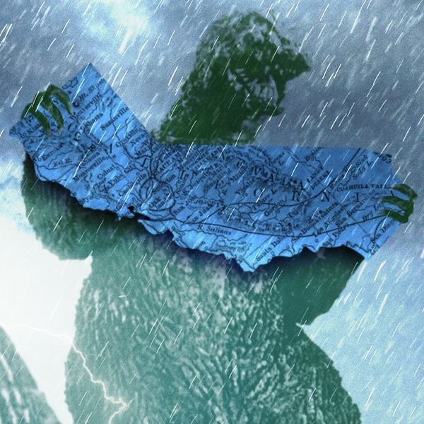
When I was young, I remember when the first Godzilla movie came out. After a few sequels, the producers discovered that maybe there were some other prehistoric creatures that were also awakened by the nuclear testing. And then we got movies called Godzilla vs. Mothra and Godzilla vs. Rodan. I think the climate crisis versus artificial intelligence is a little bit in that category. If you look at the list of concerns about data centers and artificial intelligence more broadly, the emissions are a problem of concern but not a justification for panic. You could take all of the AI data centers in the world and quadruple the number, and their total emissions would still be a fraction of the emissions from uncovered landfills around the world. That is a point of leverage for activists concerned about AI, but it’s not the biggest concern. I think that cognitive atrophy, and the emergence of an intelligence that makes us no longer the apex intelligence on the planet, is a cause for very, very deep concern. They have something else in common. Donald Trump has called both of the concerns hoaxes, which is a clear sign we need to be concerned about them. When he says the climate crisis is a hoax, it’s sort of like his AI slop. You immediately know that it’s nonsense and false, but it has an impact nonetheless. And we’ve already had an experience with AI in its first generation, in the form of the algorithms that direct attention flows on the internet. Look at what that’s done. My goodness. It’s just crazy. A lot of guys now have to swipe left 1,000 times to get one cup of coffee with a girl. Body image problems with young girls. And the rabbit holes that suck people down. You know what’s at the bottom of the rabbit hole? That’s where the echo chamber is. And when you spend too long in the echo chamber, you face another kind of AI: artificial insanity. That’s where QAnon comes from, and that is what sustains climate denial, again funded lavishly by the fossil fuel interests. On any story about climate, you click on the comment section and it’s always — you know this — stuffed with anti-climate memes and falsehoods, or zombie falsehoods. Orwell said in one of his essays that we as human beings are capable of holding onto a false belief indefinitely, even when it is completely proven to be false to any reasonable person. And then as he continued impudently twisting words to make it seem we were right all along, he said, “The only problem is that eventually a false belief collides with a solid reality, comma, usually on a battlefield.” So we are now on a battlefield, in Iran and in the Persian Gulf and at the mouth of the Red Sea. Again, this has further awakened the concern that yes, we have to address this. On the emissions side of artificial intelligence, just briefly: Nick Stern at the London School of Economics and the Grantham Institute published a very influential study a few months ago showing that the emissions reductions from AI are going to be quite substantial. Unfortunately, it’s also going to supercharge the discovery of more fossil fuel assets, and that will offset it to some extent. But I think it can bring some net benefits in that regard. But we need to watch for cognitive atrophy. Fifteen-year-olds are reading at 14-year-old levels now. Kids are doing their homework faster but doing worse on testing. There’s cognitive atrophy, cognitive surrender, cognitive offload, and cognitive foreclosure. Kids at the age when they’re learning the reasoning skills that all of us learned when we were younger — if they don’t learn those in the same way, that’s one of many serious challenges from the advanced pioneer models. And of course, now that they’re breaking out of their confinement, it reminds me of Jurassic Park, where the velociraptors are testing the electric fences, you know?
Robinson Meyer:
I like this mode of existential risk as Godzilla and Mothra and Nadir. I think this is a good way to think about it. We need to get you on Shift Key, Heatmap’s podcast. Unfortunately, we’re going to have to leave it there, but thank you so much for joining us.
Al Gore:
Thank you, Robinson. Thank you all very much.