At a New York Mets game this weekend, I saw something I’m not used to seeing until late summer. No, not the inexplicable late-season implosion of a beloved local franchise — a neon-red setting sun.
West Coasters know this sun well. I call it the “Eye of Sauron” sun; others say it’s “blood-red.” In reality, the color is harder to describe, more like the red-orange-pink insides of a halved grapefruit. It feels unnatural and eerie, and is the effect of shorter wavelengths of light being filtered out of a sunrise or sunset by particles in the air caused by pollution, including wildfire smoke.
I immediately grabbed my phone to find the source of the haze, but a quick Google search of “Where is this smoke coming from?” didn’t turn up any immediate results. In fact, it can be frustratingly difficult to figure out the origin of wildfire smoke when you see or smell it. This only gets more difficult as fire season wears on; is the smoke you’re inhaling from a small nearby fire, or part of a bigger burn blowing in from somewhere else?
Unfortunately, there isn’t a handy app yet that will simply tell you “the smoke overhead is from the Canadian fires” — which, in the case of the pollution I was experiencing in Flushing Meadows, it actually was. But you can cobble together an answer about where smoke is coming from by using a few different methods.
The best way to identify the source of wildfire smoke
When you climb a mountain, an inaccurate forecast can be the difference between life and death. I learned about the MyRadar app from an experienced mountaineering guide who swears it is the most accurate weather app on the market. It’s also become my go-to app for figuring out where the wildfire smoke I’m inhaling is coming from.
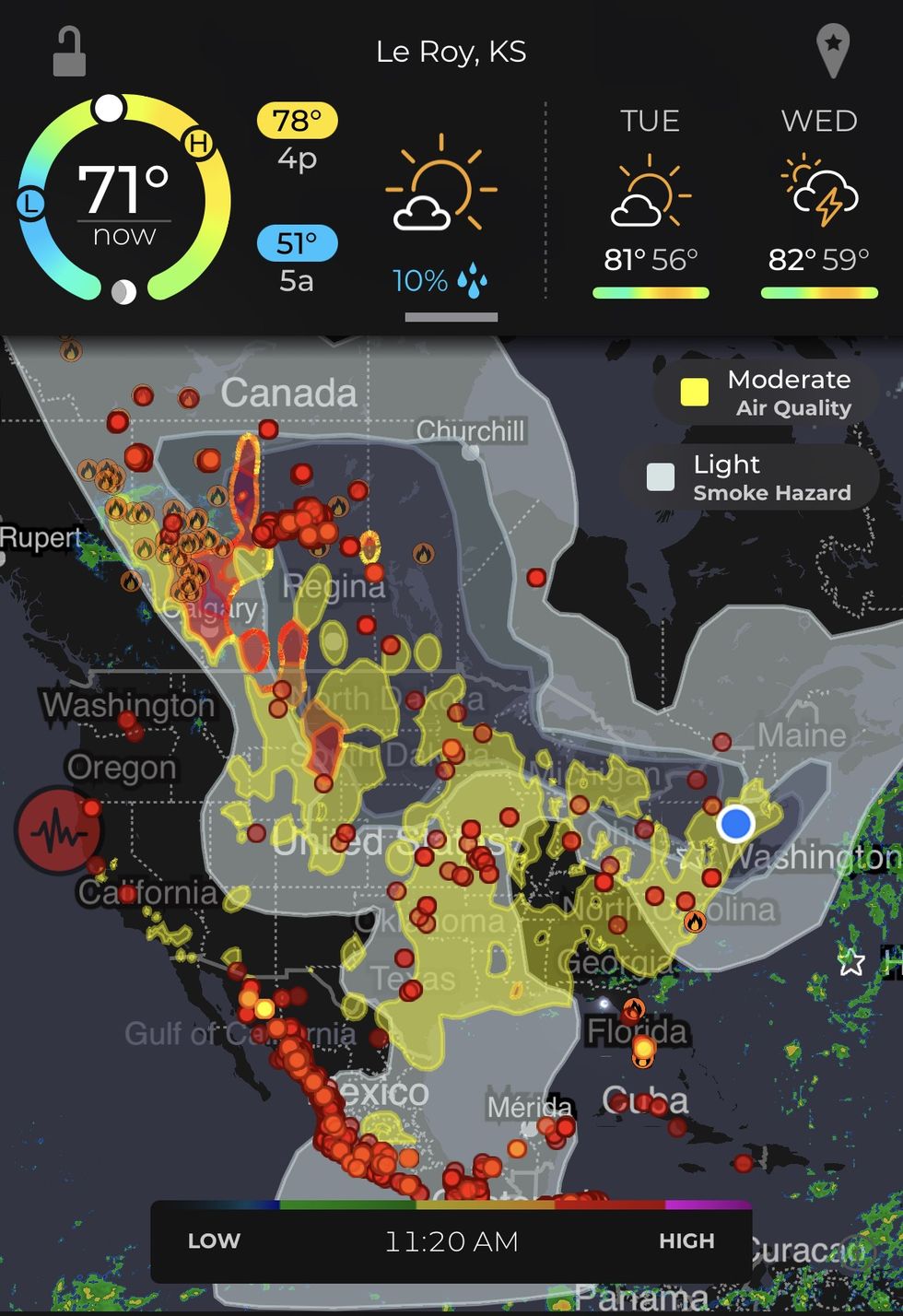
The app pulls data from the United States Geological Survey, InciWeb, and the United States Forest Service’s Risk Incident Information Management System to build its smoke and fire maps (it also received a wildfire detection grant from the National Oceanic and Atmospheric Administration last year). Hovering over my house at around 2 p.m. on Monday, the app clearly told me I was experiencing “moderate air quality” and “heavy smoke hazard.” Zooming out, it’s easy to guess based on the shape of the “heavy smoke hazard” cloud that the pollution is wrapping down from the massive fires burning in Alberta, Saskatchewan, and British Columbia. You can also overlay wind patterns on the app for further confirmation.
 The three shades of gray in the center of the continent shows the path of smoke from the Canadian fires.MyRadar
The best way to cross-check the result within the U.S.
MyRadar’s visuals can get a little cluttered, though, and parsing this information still leaves you with an informed guess. But it’s one that can be easily cross-checked against the EPA’s AirNow app.
The EPA app is a little more straightforward: It gives users an upfront measurement of their air quality index, or AQI, which, with a click, can be broken down into “primary pollutants.” In the case of New York City on Monday, it was PM2.5, the expected particle from wildfire smoke (and also “the bad one” when it comes to your health). The app also shows a “forecast” of how the AQI is expected to develop over the coming hours; in New York’s case, it was going to get worse before it got better.
The AirNow app additionally has a “smoke” tab that shows a similar smoke plume overlay as MyRadar’s. By clicking on the globe in the upper left-hand corner, you can view additional fire information, including how far away the nearest burn is, and confirm if you’re under a smoke plume. Using these two pieces of information together, you can further deduce if the smoke you’re experiencing is blowing in from somewhere far away or nearby (some of New York’s smoke may be from the Cannon Ball 2 Fire to our northwest, in Passaic County, New Jersey, but the app shows me that fire is fairly small — 107 total acres — and so in this case, it is not the main culprit).
 Information under the smoke tab on the AirNow app.AirNow
The best way to figure out which way the smoke is blowing
The BlueSky Canada Smoke Forecasting System (FireSmoke Canada) is run by the University of British Columbia, and while it has an emphasis on Canadian air quality, it is run in partnership with the United States Forest Service and includes U.S. data too. The FireSmoke Canada website specifically tracks PM2.5 smoke particles at ground level from wildfires across North America (“ground level” is an important distinction because sometimes smoke plumes will be too high in the atmosphere to actually affect your health). The FireSmoke Canada map throws in a time-lapse animation and for my purposes, it clearly showed that the smoke in New York was coming down from the Canadian fires.
The FireSmoke Canada map is also a great way to figure out the origin of local fire smoke too since it often shows plumes from even small blazes (though it has technical limitations too, which it details in its FAQ). Unfortunately, the service doesn’t allow users to click on a fire to learn more information about it, which means toggling back and forth between the AirNow or MyRadar app, or the FIRMS U.S./Canada website, to get a fuller picture of what is going on.
 The FireSmoke Canada website tracks PM2.5 with a handy animation but does not offer information about individual fires like MyRadar and AirNow do.FireSmoke Canada
Other discrepancies between the apps can be frustrating; AirNow, for example, still shows the Great Lakes Wildfire as burning in North Carolina, though it’s not appearing on FireSmoke Canada’s tracker; MyRadar provides the most context, showing the containment at 90% and labeling its status as “minimal.” On the other hand, MyRadar and AirNow don’t show a fire near Hanford, Washington, while MySmoke Canada does.
Short of doing your own detective work with various wildfire tracking services, local media otherwise remain the best option for figuring out where smoke is coming from. The Hanford blaze that eluded MyRadar and AirNow, for example, is easily confirmed by the regional press; started by lightning, the fire reportedly burned around 1,000 acres and is now 100% contained.
Turns out, Googling “Why is it smoky outside” — while it might feel archaic — still might be one of the best options.


 The three shades of gray in the center of the continent shows the path of smoke from the Canadian fires.MyRadar
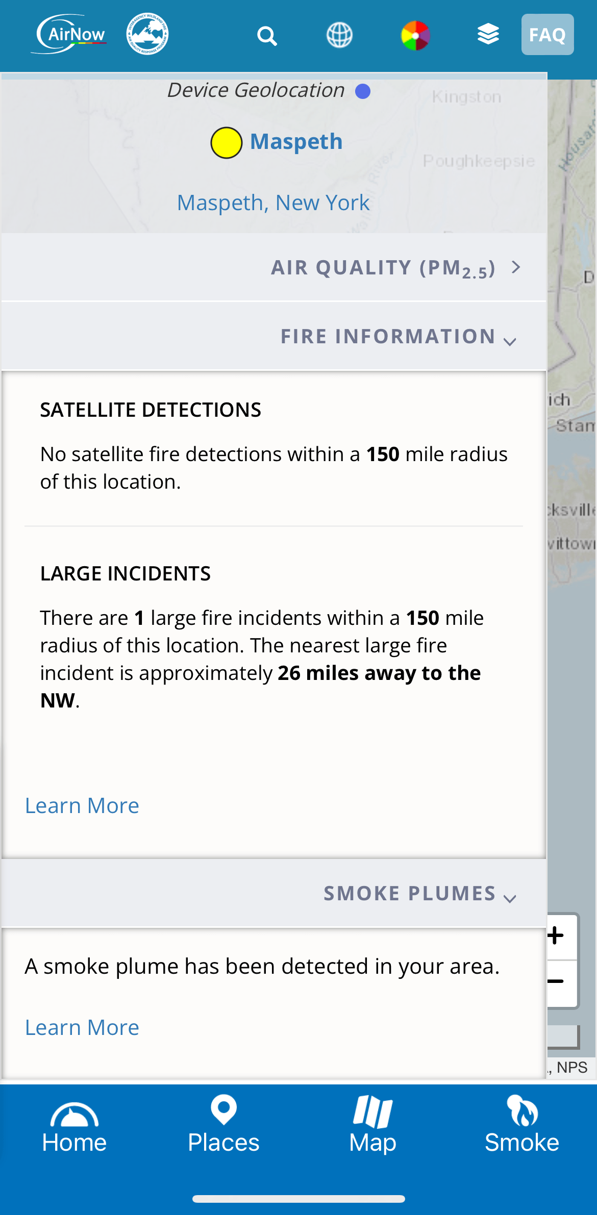 Information under the smoke tab on the AirNow app.AirNow
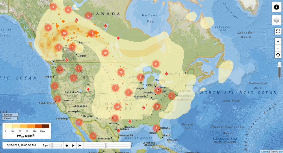 The FireSmoke Canada website tracks PM2.5 with a handy animation but does not offer information about individual fires like MyRadar and AirNow do.FireSmoke Canada