The legislation, which applies to all types of generation, would allow new power plants to connect to the grid without waiting for the arduous technical studies — and without paying the exorbitant equipment upgrade fees — now required in much of the country.
Instead, the bill would let power plants opt into a much faster safety study and offer what it cheekily dubs “basic access service for energy-only delivery” — that is, BASED service — to the local electricity market.
A similar approach is already used in Texas, which has added more new generation than any other U.S. power market in recent years. In effect, Heinrich hopes to bring that cheaper, faster, and more laissez-faire method to the rest of the country.
“As electricity demand grows, we need to find better, faster ways to add more affordable, reliable power to the grid,” Heinrich said in a statement. “Right now, unnecessary delays are slowing projects that could help lower energy costs and deliver the low-cost energy we need.”
Outside experts have pushed for wider adoption of Texas’s approach, which is dubbed “connect and manage,” for some time. Although Heinrich’s proposal would apply to all kinds of power plants, Texas has been particularly successful at bringing new solar, battery, and natural gas power plants online in recent years — and it has done so while keeping connection costs lower than other markets.
“We’re seeing the success of the free market in Texas,” Sarah Toth Kotwiss, an electricity researcher at the energy and climate think tank RMI, told me, noting the state has added far more generation in recent years than much bigger and more populous U.S. grid zones. “They’re leading the way, and replicating that free market attitude could go a long way in the rest of the U.S.”
More broadly, the proposal is the kind of legislation that would slot into the bipartisan permitting package expected later this year — and as soon as next month. Heinrich’s proposal may be a sign that the senator, the ranking Democratic member of the natural resources committee, takes the prospect of reaching a deal seriously.
Across much of the country, a new power plant can only connect to the power grid after the local grid operator completes what’s called an “interconnection study” — an intensive technical account of how that new plant will affect the overall system.
These studies examine a slew of worst-case scenarios, simulating how the plant would behave at full capacity under extremely congested grid conditions, such as during a heat wave. The new plant’s developer is then required to pay for the grid and transmission line upgrades that would allow their project to run at full blast at those moments of maximum stress.
In theory, that approach maximizes the amount of money a developer can make on a new power plant. But because the grid is a big, interconnected system, that method can cause long delays and rippling costs in practice. In one case, a new 300-megawatt plant in North Dakota near the Canadian border could not start operating until it paid nearly $3 million to upgrade power lines and transformers in Missouri — more than 1,000 miles away.
And because interconnection studies try to model a proposed power plant’s influence on the power grid for years into the future, a single cancellation can have a cascading effect. When a power plant pulls out of the interconnection queue, every project in line behind it sometimes needs to be studied again, causing delays and costs to spiral even further.
In one famous example, a solar and battery plant in Maryland was initially told that it needed to pay for $1.25 million to connect to the local grid. But after a series of cancellations and new rounds of study, that figure was revised — to nearly $72 million. The solar project got shelved.
While interconnection queues used to be relatively quick, the process of hooking up a new power plant to the grid can now regularly take eight years, Kotwiss said.
As I discussed with the electricity researchers Tyler Norris and Claire Waymer on Heatmap’s podcast Shift Key in 2024, these lengthening wait times have changed how power plant developers behave. Many developers now “spam the queue,” filing study requests for any project that they could ever conceivably want to build. That has led delays to spiral even further.
The end result of all this spamming is that the total capacity of power plants asking to connect to the grid now exceeds the size of the U.S. grid itself. At the end of 2025, more than 2,000 gigawatts of new generation or storage projects were waiting in interconnection queues, according to the Lawrence Berkeley National Lab. The country’s operating power plant fleet is only about 1,400 gigawatts.
To be clear, most of those proposed projects will never be built — they are hypothetical queries submitted by developers who are trying to claim a place in line. Yet even switching on a small set of plants could transform the power grid.
These long wait times aren’t the norm in Texas. In the Lone Star state, it takes less than four years to bring a new plant online.
That’s because new power plants in Texas can hook up to the grid — and start generating power — as soon as the local grid operator completes a more rudimentary engineering and safety study. Then during moments of peak grid congestion, power plants must curtail their own generation, reducing their electricity production to the level that the overall grid can support. While this means that a given solar farm or natural gas plant might not run at full bore all the time, the overall approach gets that plant up and running much sooner, allowing it to sell energy into the grid during most of the year.
Heinrich’s law would order electricity markets and grid operators to make this faster option available to new power plants across the country. It would let power plants opt into receiving a much simpler and faster study, one that checks only that adding the new power plant will be safe for the immediate grid.
A power plant that opts into the new BASED service would still have the option of entering the traditional interconnection queue. Doing so would let it eventually increase its operation over time, paying for grid upgrades so that it can participate in capacity markets and other auctions.
Expanding Texas’s approach to other states could help cut costs for electricity consumers by bringing more energy onto the market faster, Kotwiss said. Even in complicated power markets that include additional auctions — for capacity, for instance, or reliability — energy still makes up most wholesale costs.
It could also help ease the strains on the grid — especially in congested regions like the Mid-Atlantic — caused by artificial intelligence data centers and new factories.
The Texas-inspired technique could help the solar and battery industries, because it keeps a given project’s upfront expenses low and allows those technologies’ low costs to dominate their economics. Solar has boomed in Texas in recent years, and the state now has more utility-scale solar installed than California does.
But the BASED approach would likely help natural gas plants and other forms of newer, cheaper generation, too, because it strengthens new entrants as compared to incumbents. Jacob Mays, a Cornell engineering professor, has studied how slow and wonky interconnection queues can prevent electricity markets from functioning well. The existing interconnection approach used in most of the country “amounts to a significant barrier on new entry to new generation,” he told me, and it has “some anticompetitive impacts.”
Heinrich has said that he plans on introducing more electricity system reforms soon, including a bill to push utilities to adopt technologies that get more capacity out of their existing equipment.
I think it’s an encouraging sign for permitting reform advocates that ranking Senate Democrats are advancing these kinds of technology-neutral power market bills. An eventual deal will likely ultimately rest on Democrats’ willingness to support policy like this — and whether they can strike a deal with Republicans to rewrite parts of long-standing environmental or permitting laws, including the National Historic Preservation Act and Clean Water Act.
But just as importantly, it will depend on Republicans — and the White House — reining in President Trump’s powers to kill energy projects by fiat. With this bill, Democrats are suggesting they’re willing to be, well, a little BASED. Whether the president will join them remains to be seen.


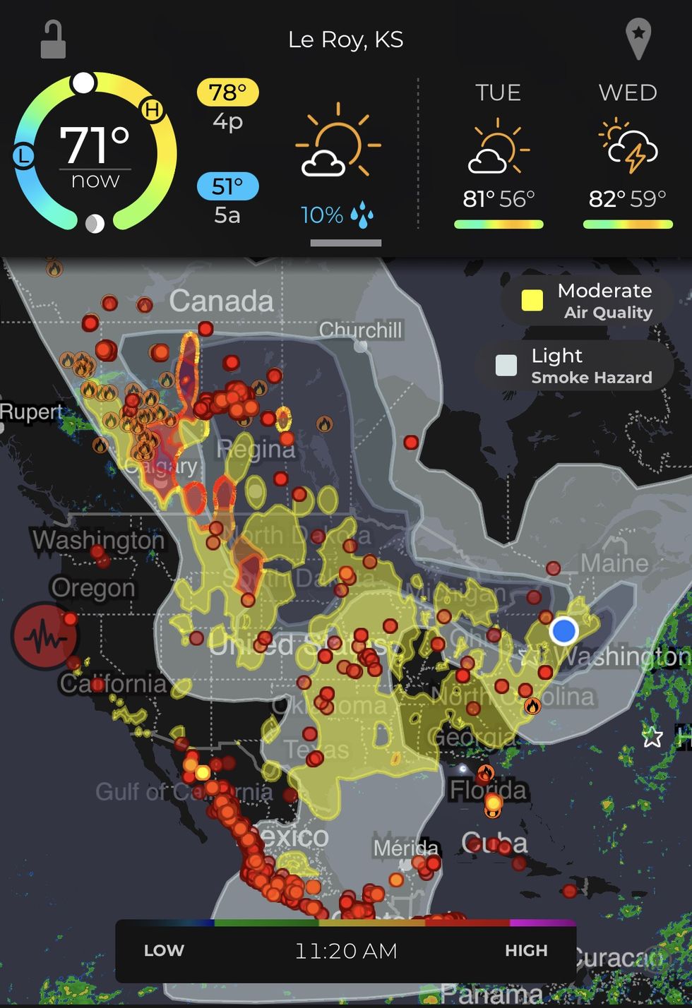 The three shades of gray in the center of the continent shows the path of smoke from the Canadian fires.MyRadar
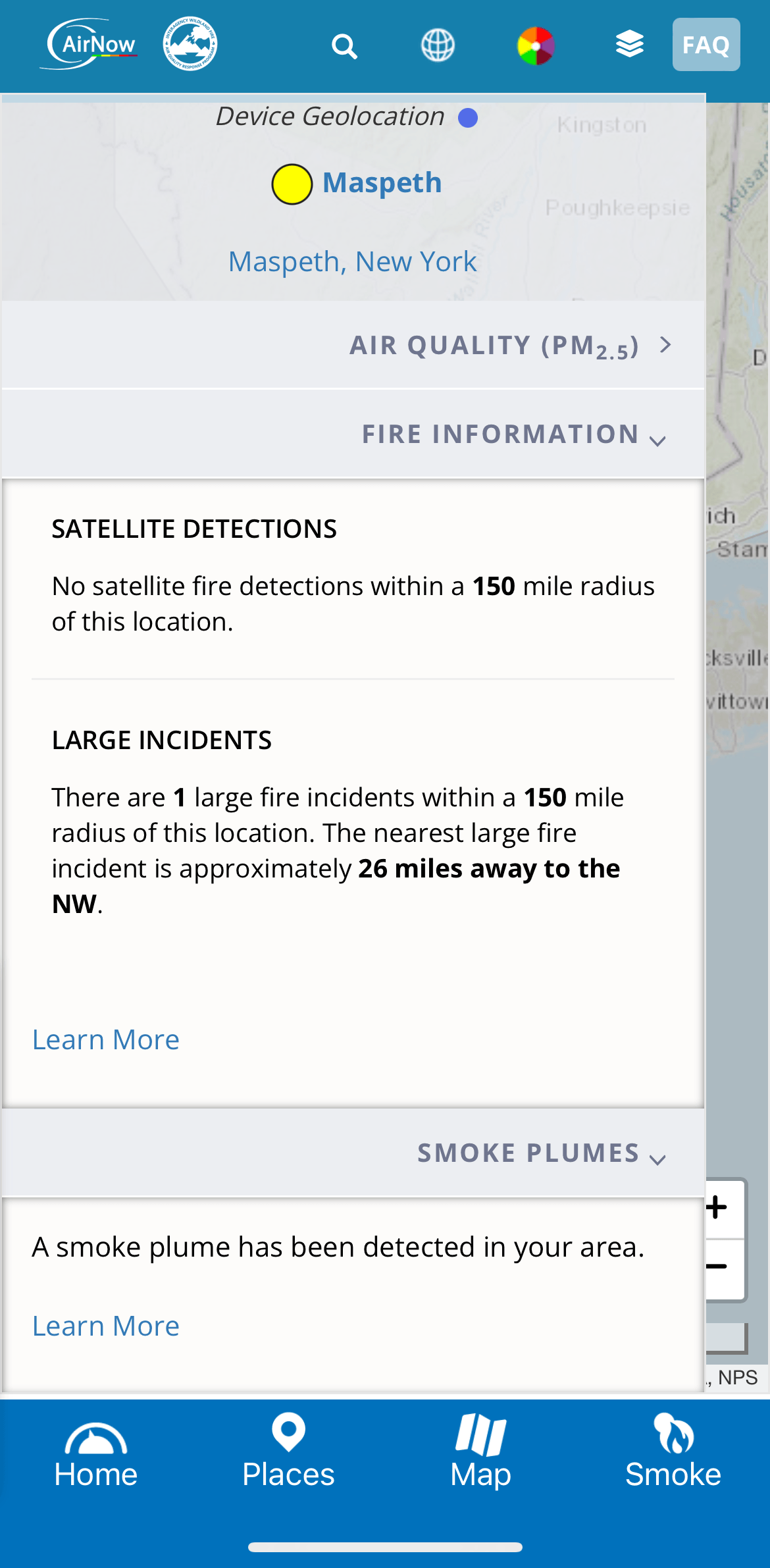 Information under the smoke tab on the AirNow app.AirNow
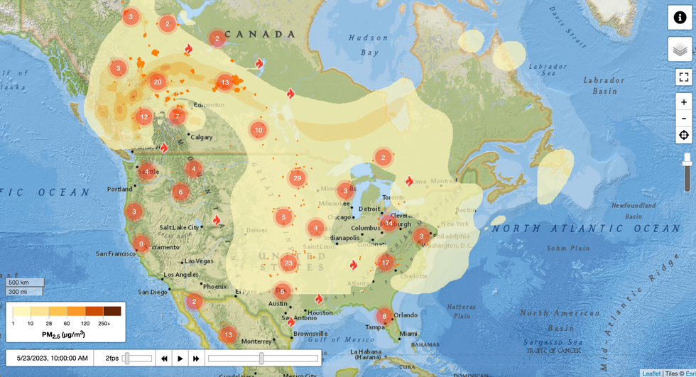 The FireSmoke Canada website tracks PM2.5 with a handy animation but does not offer information about individual fires like MyRadar and AirNow do.FireSmoke Canada


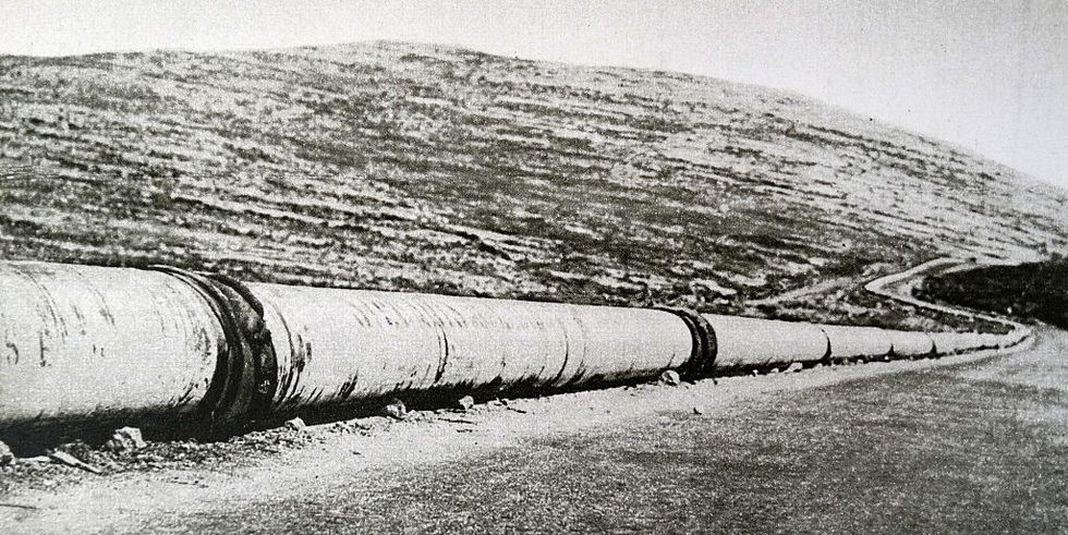 An oil pipeline built in 1926 from Syria to Iraq. A century later, another may be coming. Universal History Archive/Universal Images Group via Getty Images