Methane-sniffing satellites have brought unprecedented visibility to “super-emitter” events, when the planet-warming gas gushes into the atmosphere at alarming rates — often from leaky fossil fuel infrastructure.
But those plumes contain more than just methane. Scientists are now using satellite data to look beyond the climate risks and assess the danger of super-emitting wells, tanks, and other assets to nearby communities.
PSE Healthy Energy, an independent energy science and policy institute, unveiled a “Methane Risk Map” on Tuesday that illustrates the spread of health-harming pollutants like benzene and toluene that also emanate from methane super-emitter events.
“The Methane Risk Map translates methane as a climate problem into methane as an air quality and human health issue,” Seth Shonkoff, PSE’s executive director, said during a briefing last week.
The vast majority of what we call “natural gas” is methane, but when it comes out of the ground, it also contains a host of other compounds, including carcinogens. The exact mix varies by location, and also changes as it moves through the oil and gas supply chain.
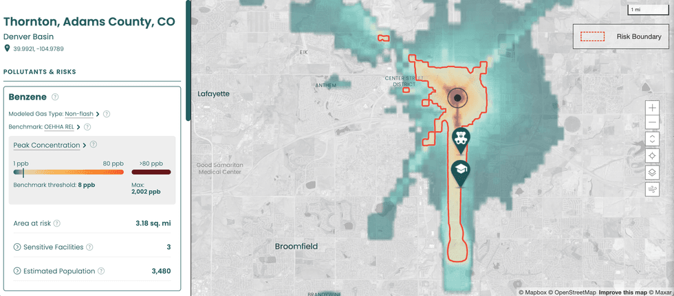
The Methane Risk Map is a web tool with clickable markers representing individual methane super-emitter events throughout the U.S. Selecting one opens up a heatmap and information panel that shows the concentration of benzene, methane, and other pollutants present in that particular plume, the modeled distance each one traveled during the event, the demographics of the population exposed, and whether there were any sensitive facilities, such as schools or hospitals, in the exposure pathway. It also gives the date the emission event occurred and what kind of equipment it came from, if available, such as a well or a tank.
 Courtesy of PSE Healthy Energy
Underlying the map are two relatively new scientific developments. The first, as mentioned earlier, is satellite data. PSE pulls data released by the nonprofit Carbon Mapper, which launched its premiere satellite a year ago. Carbon Mapper’s sensing tools, developed in collaboration with NASA, essentially point a telephoto lens at oil or gas facilities to detect methane super-emitter events and measure how much of the gas is streaming out.
The problem, however, is that the satellite can only detect methane.
To solve that problem, PSE researchers created a database of the composition of natural gas at more than 4,000 facilities, spanning 19 oil- and gas-producing basins. When oil and gas operators apply for air permits, they have to submit facility-specific gas composition data from laboratory reports, often derived from direct samples of the gas. Researchers from PSE Healthy Energy went through thousands of regulatory documents to compile a database based on these reports. They found hazardous pollutants in more than 99% of the samples.
To build the Methane Risk Map, PSE combined methane emission rates from Carbon Mapper with this site-specific gas composition data, then used an air dispersion model to estimate the peak concentrations of each pollutant in the surrounding area after the release and show the area at risk. The map includes risk benchmarks set by state regulators for each pollutant, and shows that hazardous air pollutant levels from these super-emitters often exceed them.
While methane itself isn’t toxic, it can pose a safety risk at high enough concentrations from explosions or fires. So in addition to information about traditional air pollutants, users can also view the extent to which the methane released by an event posed a threat to the surrounding area.
One of the shortcomings of the project, and of methane-mapping efforts in general, is that the data isn’t accessible in real time. Carbon Mapper takes roughly a month from when its satellite spots a super-emitter to process and release the emissions data publicly — then PSE will have to run its own models and update its map. The satellites also represent only a moment in time — they don’t tell you when a leak started or how long it lasted. While the time delay could improve with technological and other advances, fixing the latter would require a lot more satellites.
The Methane Risk Map can’t yet function as an emergency response tool in a public health context, but that also wasn’t quite the intent behind the project. The PSE researchers envision policymakers, regulators, lawyers, and communities using the tool to push for stronger regulations, such as safer setback distances, stricter air quality monitoring requirements, and leak detection and repair rules.
The Environmental Protection Agency finalized stronger rules regulating methane and air pollution from the oil and gas sector in 2023, under the Biden administration. But after Trump took over the federal apparatus, the agency said it was “reconsidering” those rules. Since then, the EPA has extended compliance deadlines for many of the rules.
“As regulatory rollbacks in the climate and air quality arenas occur in the coming months, having this type of defensible data on the risk of these events and the risks they pose to human health will become increasingly important,” Kelsey Bilsback, the principal investigator for the project, said during the briefing.
Right now the map only includes emissions from the “upstream” oil and gas sector, but PSE plans to expand the project to include leaks from the midstream and downstream, too, such as pipelines and end-users.


 Courtesy of PSE Healthy Energy