You’re out of free articles.
Log in
To continue reading, log in to your account.
Create a Free Account
To unlock more free articles, please create a free account.
Sign In or Create an Account.
By continuing, you agree to the Terms of Service and acknowledge our Privacy Policy
Welcome to Heatmap
Thank you for registering with Heatmap. Climate change is one of the greatest challenges of our lives, a force reshaping our economy, our politics, and our culture. We hope to be your trusted, friendly, and insightful guide to that transformation. Please enjoy your free articles. You can check your profile here .
subscribe to get Unlimited access
Offer for a Heatmap News Unlimited Access subscription; please note that your subscription will renew automatically unless you cancel prior to renewal. Cancellation takes effect at the end of your current billing period. We will let you know in advance of any price changes. Taxes may apply. Offer terms are subject to change.
Subscribe to get unlimited Access
Hey, you are out of free articles but you are only a few clicks away from full access. Subscribe below and take advantage of our introductory offer.
subscribe to get Unlimited access
Offer for a Heatmap News Unlimited Access subscription; please note that your subscription will renew automatically unless you cancel prior to renewal. Cancellation takes effect at the end of your current billing period. We will let you know in advance of any price changes. Taxes may apply. Offer terms are subject to change.
Create Your Account
Please Enter Your Password
Forgot your password?
Please enter the email address you use for your account so we can send you a link to reset your password:
What Angelenos can learn from the Maui Wildfire Exposure health survey.
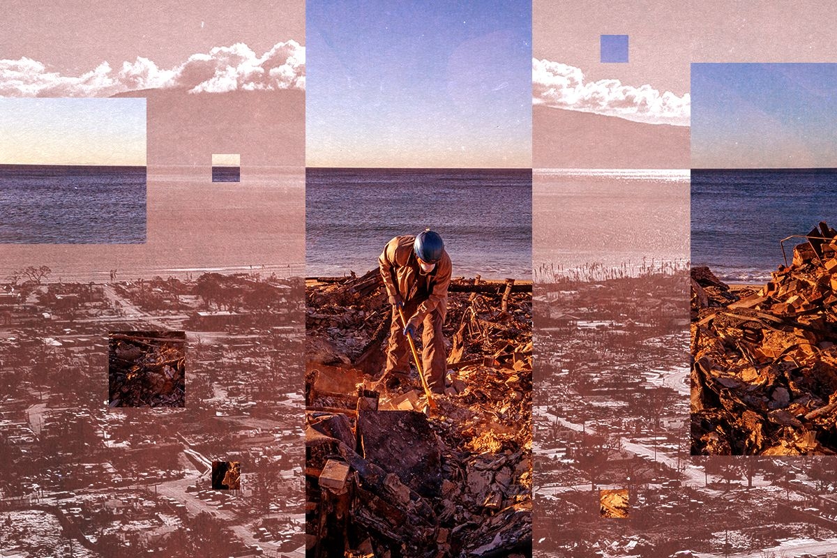
After a week and a half of unimaginable destruction, Los Angeles is at last beginning to look toward its recovery from the Palisades and Eaton fires. Traversing that stage will take years, not only because of the significant economic and political implications of the fires, but also because of what they will mean for the health and well-being of the thousands of residents who live in or near the burn zones.
Los Angeles isn’t navigating the crisis alone, though. In the wake of the deadly 2023 Maui wildfire, researchers at the University of Hawaii launched the Maui Wildfire Exposure Study, a multi-year effort to track the disaster’s physical and mental health impacts on residents. Though the demographics of West Maui differ greatly from those of Pacific Palisades or Altadena — two of the most affluent zip codes in the country — California public officials, medical professionals, and wildfire survivors can still learn from the ongoing work of the MauiWES.
To that end, I spoke yesterday with Ruben Juarez, one of the study’s lead researchers. Our conversation has been edited and condensed for clarity.
What is the Maui Wildfire Exposure Study?
The Maui Wildfire Exposure Study follows a comprehensive cohort of people affected by the 2023 fires. We collected data six months after the fire, and typically, we’re looking for the long-term effects. For 60% of the individuals who came to the study, it was their first health check since the fires.
It is a pretty interesting population: They’re underserved and typically lack access to health care. We found three main trends: The first was mental and physical health issues. Access to care was a big issue in Hawaii, and I’m hoping that’s not going to be the case in California, but it definitely was here. Housing, job, and food insecurity were other big issues, as were the social impacts.
What have you learned about the mental and physical health of people exposed to the Maui wildfires?
Pre-wildfire we knew that the rate of depression symptoms in the Maui population was about 30%. Post-wildfire, we’re seeing more like 52%, so more than one in two participants in the study were showing depression symptoms. Low self-esteem was another issue. Something that was really worrisome was suicidal ideation: Pre-wildfire, it was less than 1%; post-wildfire, at least for the people in the cohort, it was about 4% of the population. That’s more than a four-time increase.
The second issue is physical health: Nearly half of the participants reported worse health since the fires. We saw respiratory issues, such as coughing, wheezing, difficulty breathing, and also skin and eye irritation, fatigue, and weakness. We’re seeing that about 74% of the participants are facing a heightened risk of cardiovascular disease. We also performed a lung check using spirometry and oscillometry breathing. Based on the spirometry measure, 60% of participants may have poor lung health, and 40% may have mild to severe lung obstruction. We believe this is associated with the exposure to ash and the personal protective equipment individuals wore when they returned to the fire site.
We’ve written a lot about the dangers of wildfire smoke at Heatmap, but I think people are less aware of the risks of wildfire ash. Could you say more?
It’s really toxic. People need to take care of themselves. There are the harmful substances you’d expect in ash: lead, arsenic, asbestos — those are poisons.
Why was our population in Lahaina affected by this? Because they went back to the burned homes and did not wear any PPE. To me, that was crazy. The county said that wearing PPE was a voluntary decision, and that was a mistake. And PPE is not just a mask: you really need eye protection, gloves, footwear, and long clothing, because the ash is really toxic.
Even in small amounts, the poisons in ash can harm the lungs and the heart, and there are long-term effects, including cancer, which is one of the things we’re trying to prevent. In the case of Hawaii, for the initial batch of 767 individuals in the study, we did a heavy metal analysis — a comprehensive panel of 32 of the most expected heavy metals. We already knew that five of the most common heavy metals were found in ash present in Hawaii: arsenic, lead, antimony, copper, and cobalt. We learned that 20% of participants affected by the fires in our cohort were showing an elevated level of at least one of these heavy metals, which is not something that you would expect. We don’t want these things in our bodies at any level. People must know that these things are harmful and they need to take care of their health.
And that’s all just from people returning to their homes and sifting through the ash? Or can ash blow into an area that didn’t burn and affect people that way, as well?
Many participants were uneducated about the harmful effects ash has, especially when it has contact with your skin. But you should also avoid breathing or swallowing soot and ash at any cost. The effects were seen in individuals who had direct contact at a site or were indirectly exposed through smoke or blowing winds — but the majority was direct contact.
That’s so scary.
Not everything was bad news. We found some exciting ways to potentially address some of these issues. For instance, resiliency was at the top of the minds of many participants in the study: “How can I be resilient? How can I survive this catastrophe?”
We also found that lower-income individuals trust and use community organizations more than government services, like federal, state, and county agencies. This information could potentially help us intervene, especially when considering underserved populations like immigrant populations. They just don’t trust the government. Addressing issues through community organizations on the ground was extremely helpful because it allowed people to access the services they needed.
Another thing that we noticed that was super helpful was that people who maintain strong relationships with family and friends experience better health outcomes. Social isolation after a wildfire was really bad, especially for mental health problems. Individuals who are more connected with their friends, family, or are doing something in their community volunteering tend to have better health outcomes, particularly in terms of depression.
How close do you need to have been to a wildfire to experience these effects?
Individuals whose homes were on the perimeter of the burn area experienced more physical symptoms, worse quality of life, and worse mental health. But that doesn’t mean that if your house doesn’t burn, you will not experience any of the symptoms. Even if you didn’t go to a contaminated site, there was all the smoke over the city, and you’re exposed to that. Individuals who are not directly affected can be indirectly affected — at a lower rate, of course, as you’d expect.
Many of the mental health impacts you described were related to things like housing, job, or food insecurity, as well as the lack of access to healthcare resources following a fire. Would you expect mental health impacts to not be as bad in L.A., since it was a more affluent area that burned?
Yes. In fact, coincidentally, one of our scientific advisory board members is a resident of L.A., and he’s been saying that he doesn’t expect the health effects to be as bad in L.A. as they were in Maui because the shortage of doctors is not as big. Also, the type of demographic that is being affected is more affluent.
Having said that, in Hawaii, we had the advantage of winds that blew smoke and soot away. I was reading reports that in L.A., there were no winds, and the smoke was just staying there. In that case, the effects in terms of pulmonary health won’t just be the people directly affected, but the whole city.
What would you want emergency managers and medical professionals in Los Angeles to know about your study as they address the impacts of these fires?
First, we must emphasize to people that this is not a forest fire; houses are burning, full of toxic substances. People need to know that if they return to the burn zone, they need to take care of their health and ensure they are wearing PPE. We need to conduct many communication campaigns around this.
The second thing is, don’t underestimate the power of community and community organizations, especially in L.A., where there are many immigrant populations. Community organizations should be used to provide information because people don’t trust the government or FEMA officials.
The third thing I would emphasize is that after a disaster, when people struggle with housing, job, and food insecurity, their health becomes a lower priority. This is understandable, but unfortunately, neglecting your health at this time can worsen the long-term effects. It’s really important that we emphasize to individuals that even if you don’t have a house or a job right now, you need to take care of your health.
An example of this is in the aftermath of 9/11; years later, more lives have been lost due to exposure to environmental hazards than the disaster itself. If we don’t intervene early on, things can get really bad. That’s what we are trying to do: prevent those long-term effects from happening.
Log in
To continue reading, log in to your account.
Create a Free Account
To unlock more free articles, please create a free account.
The Methane Risk Map combines satellite and geologic data to visualize chemical exposure from natural gas plumes.
Methane-sniffing satellites have brought unprecedented visibility to “super-emitter” events, when the planet-warming gas gushes into the atmosphere at alarming rates — often from leaky fossil fuel infrastructure.
But those plumes contain more than just methane. Scientists are now using satellite data to look beyond the climate risks and assess the danger of super-emitting wells, tanks, and other assets to nearby communities.
PSE Healthy Energy, an independent energy science and policy institute, unveiled a “Methane Risk Map” on Tuesday that illustrates the spread of health-harming pollutants like benzene and toluene that also emanate from methane super-emitter events.
“The Methane Risk Map translates methane as a climate problem into methane as an air quality and human health issue,” Seth Shonkoff, PSE’s executive director, said during a briefing last week.
The vast majority of what we call “natural gas” is methane, but when it comes out of the ground, it also contains a host of other compounds, including carcinogens. The exact mix varies by location, and also changes as it moves through the oil and gas supply chain.
The Methane Risk Map is a web tool with clickable markers representing individual methane super-emitter events throughout the U.S. Selecting one opens up a heatmap and information panel that shows the concentration of benzene, methane, and other pollutants present in that particular plume, the modeled distance each one traveled during the event, the demographics of the population exposed, and whether there were any sensitive facilities, such as schools or hospitals, in the exposure pathway. It also gives the date the emission event occurred and what kind of equipment it came from, if available, such as a well or a tank.
Courtesy of PSE Healthy Energy
Underlying the map are two relatively new scientific developments. The first, as mentioned earlier, is satellite data. PSE pulls data released by the nonprofit Carbon Mapper, which launched its premiere satellite a year ago. Carbon Mapper’s sensing tools, developed in collaboration with NASA, essentially point a telephoto lens at oil or gas facilities to detect methane super-emitter events and measure how much of the gas is streaming out.
The problem, however, is that the satellite can only detect methane.
To solve that problem, PSE researchers created a database of the composition of natural gas at more than 4,000 facilities, spanning 19 oil- and gas-producing basins. When oil and gas operators apply for air permits, they have to submit facility-specific gas composition data from laboratory reports, often derived from direct samples of the gas. Researchers from PSE Healthy Energy went through thousands of regulatory documents to compile a database based on these reports. They found hazardous pollutants in more than 99% of the samples.
To build the Methane Risk Map, PSE combined methane emission rates from Carbon Mapper with this site-specific gas composition data, then used an air dispersion model to estimate the peak concentrations of each pollutant in the surrounding area after the release and show the area at risk. The map includes risk benchmarks set by state regulators for each pollutant, and shows that hazardous air pollutant levels from these super-emitters often exceed them.
While methane itself isn’t toxic, it can pose a safety risk at high enough concentrations from explosions or fires. So in addition to information about traditional air pollutants, users can also view the extent to which the methane released by an event posed a threat to the surrounding area.
One of the shortcomings of the project, and of methane-mapping efforts in general, is that the data isn’t accessible in real time. Carbon Mapper takes roughly a month from when its satellite spots a super-emitter to process and release the emissions data publicly — then PSE will have to run its own models and update its map. The satellites also represent only a moment in time — they don’t tell you when a leak started or how long it lasted. While the time delay could improve with technological and other advances, fixing the latter would require a lot more satellites.
The Methane Risk Map can’t yet function as an emergency response tool in a public health context, but that also wasn’t quite the intent behind the project. The PSE researchers envision policymakers, regulators, lawyers, and communities using the tool to push for stronger regulations, such as safer setback distances, stricter air quality monitoring requirements, and leak detection and repair rules.
The Environmental Protection Agency finalized stronger rules regulating methane and air pollution from the oil and gas sector in 2023, under the Biden administration. But after Trump took over the federal apparatus, the agency said it was “reconsidering” those rules. Since then, the EPA has extended compliance deadlines for many of the rules.
“As regulatory rollbacks in the climate and air quality arenas occur in the coming months, having this type of defensible data on the risk of these events and the risks they pose to human health will become increasingly important,” Kelsey Bilsback, the principal investigator for the project, said during the briefing.
Right now the map only includes emissions from the “upstream” oil and gas sector, but PSE plans to expand the project to include leaks from the midstream and downstream, too, such as pipelines and end-users.
Analysts are betting that the stop work order won’t last. But the risks for the developer could be more serious.
The Danish offshore wind company Orsted was already in trouble. It was looking to raise about half of its market value in new cash because it couldn’t sell stakes in its existing projects. The market hated that idea, and the stock plunged almost 30% following the announcement of the offering. That was two weeks ago.
The stock has now plunged again by 16% to a record low on Monday. That follows the announcement late Friday night that the Department of the Interior had issued a stop work order for the company’s Revolution Wind project, off the coasts of Rhode Island and Connecticut. This would allow regulators “to address concerns related to the protection of national security interests of the United States,” the DOI’s letter said. The project is already 80% complete, according to the company, and was due to be finished and operating by next year.
While Donald Trump’s antipathy towards the wind industry — and especially the offshore wind industry — is no secret, analysts were not convinced the order would be a death blow to project, let alone Orsted. But it’s still quite bad news.
“This is another setback for Orsted, and the U.S. offshore wind industry,” Jefferies analyst Ahmed Farman wrote in a note to clients on Sunday. “The question now is whether a deal can be struck to restart the project like Empire Wind,” the New York offshore wind farm that received a similar stop work order in April, only to have it lifted in May.
Morningstar analyst Tancrede Fulop tacked in the same direction on Monday. “We expect the order to be lifted, as was the case for Equinor’s Empire Wind project off the coast of New York last May,” he wrote in a note to clients, adding an intriguing post-script: “The Empire Wind case suggests President Donald Trump’s administration uses stop-work orders to exert pressure on East Coast Democratic governors regarding specific issues.”
When the federal government lifted its stop work order on Empire Wind, Secretary of the Interior Doug Burgum wrote on X that he was “encouraged by Governor Hochul’s comments about her willingness to move forward on critical pipeline capacity,” likely referring to two formerly moribund pipeline proposals meant to carry shale gas from Pennsylvania into the Northeast. Hochul herself denied there was any quid pro quo between the project restarting and any pipeline developments. Meanwhile, the White House said days later that Hochul had “caved.”
The natural question becomes, then, what can the governors of Rhode Island and Connecticut offer Trump? At least so far, the states’ Democratic governors have criticized the administration for issuing the stop work order and said they will “pursue every avenue to reverse the decision to halt work on Revolution Wind.”
Yet they have no obvious card to play, Allen Brooks, a former Wall Street analyst and a senior fellow at the National Center for Energy Analytics, told me. “They were not blocking pipelines the way the state of New York was, so there’s not much they can do,” he said.
Even if Interior does reverse the order, the risk of a catastrophic outcome for Orsted has certainly gone up. The company’s rights issue, where existing shareholders have an option to expand their stakes at a discount, is intended to raise 60 billion Danish kroner, or around $9 billion, with some 5 billion kroner, or $800 million, due to complete Revolution. Jefferies has estimated that Revolution, which Orsted owns half of, will ultimately cost the company $4 billion.
The administration’s active hostility toward wind development “calls into question that business model,” Brooks told me. “There’s going to be a lot of questions as to whether [offshore wind developers] are going to be able to raise money.”
The Danish government, which is the majority shareholder of Orsted, said soon after the announcement that it would participate in the fundraising. The company reaffirmed that patronage on Monday, saying that it has the “continued support and commitment to the rights issue from its majority shareholder.”
Orsted’s big drop will also drag down the fortunes of its neighbor Norway, via the latter’s majority state-owned wind power company Equinor, which bought a 10% stake in Orsted late last year.
“Their investment decision looks terrible,” Brooks told me.
At the close of trading in Europe, Orsted’s market capitalization stood at around $12 billion. That’s about a third less than where it sat before the share sale announcement.
In a worst case scenario involving the cancellation of both Revolution and Sunrise Wind, another troubled offshore project planned to serve customers in Massachusetts, Fulop predicts that the long-run value of Orsted would go down enough that it would have to offer its new shares at a greater discount — which would, of course, raise less money.
The best case scenario may be that Orsted will join its Scandinavian peer in resolving a hostage negotiation with the White House, with billions of dollars of investment and over 1,000 jobs in the balance.
“The Empire Wind case suggests President Donald Trump’s administration uses stop-work orders to exert pressure on East Coast Democratic governors regarding specific issues,” Fulop wrote. Right now, it’s workers, investors, elected officials, and New England ratepayers feeling the pressure.
Using the Supercharger network with a non-Tesla is great — except for one big, awkward problem.
You can drive your life away and never notice the little arrow on the dashboard — the one next to the fuel canister icon that points out which side of the car the gas cap is on. The arrow is a fun piece of everyday design that has inspired many a know-it-all friend or TikTok. But while the intel it relays can be helpful if you’re driving a rental car, or are just generally forgetful, it doesn’t really matter in the grand scheme what side your fuel filler is on. Service stations are so big that there’s generally enough space to park at an open pump in whatever orientation a vehicle demands.
That’s not quite the case with electric cars.
When I test-drove the new Hyundai Ioniq 9 this summer, the industrial designers had included their own version of the little arrow to point out the location of the EV’s charging port. In the Ioniq 9’s case, it’s on the passenger’s side, the opposite of where you’d find the port on a Tesla. Turns out, that’s a problem. On our trip from L.A. to San Jose, Hyundai's navigation system directed me to a busy Tesla Supercharger just off the interstate in the parking lot of a Denny’s. But because of the big EV’s backward port placement, I needed two empty stalls next to each other — both of which I wound up blocking when I backed in to charge. The episode is an example of how we screwed over the present by not thinking hard enough when we built the infrastructure of the recent past.
Let’s back up. In the opening stage of the EV race, the charging question was split between Tesla and everybody else. The other electric carmakers adopted a few shared plug standards. But just like with gas cars, where the left-or-right placement of the gas cap seemed to vary arbitrarily vehicle to vehicle, there was no standardized placement of the charging port. Because all manner of different EVs pulled in, companies like Electrify America and Chargepoint built their chargers with cords long enough to reach either side of a car.
Tesla, meanwhile, built out its excellent but vertically integrated Supercharger network with only Tesla cars in mind. In most cases, a station amounted to eight or more parking spaces all in a row. The cable that came off each charging post was only long enough to reach the driver’s side rear, where all the standardized ports on Teslas can be found. The thinking made sense at the time. Other EVs weren’t allowed to use the Supercharger network. Why, then, would you pay for extra cabling to reach the other side of the vehicle?
It became a big issue late in 2022. At that point, Musk made Tesla’s proprietary plug an open-source standard and encouraged the other carmakers to adopt it. One by one they fell in line. The other car companies pledged to use the newly renamed North American Charging Standard, or NACS, in their future EVs. Then Tesla began to open many, but not all, of its stations to Rivians, Hyundais, and other electric cars.
Which leads us to today. The Ioniq 9, which began deliveries this summer, comes with a NACS port. This allows drivers to use Tesla stations without the need to keep an annoying dongle handy. But because Hyundai put the port on the opposite side, the car is oriented in the opposite direction from the way hundreds or thousands of Supercharger stations are set up. Suppose you find an empty spot between two Teslas and back in — the plug that could reach your passenger’s side port actually belongs to the stall next to you, and is in use by the EV parked there. The available cord, the one meant for the stall you actually parked in, can’t reach over to the passenger’s side.
The result is a mess. Find two open stalls next to each other and you can make it work, though it means you’re taking up both of them (stealing the cord meant for the neighboring stall and blocking the cord meant for the one you’re parked in). At giant stations with dozens of plugs, this is no big deal. At smaller ones with just 12 or 16 plugs, it’s a nuisance. I’ve walked out and moved the Rivian I was test-driving before I had all the electricity I wanted because I felt guilty about blocking two stalls. To avoid this breach of etiquette you might need to park illegally, leaving your EV in a non-spot or in a place where it’s blocking the sidewalk just so it can reach the plug. (Says Tesla FAQ: “In some cases you might have to park over the line in order to charge comfortably. Avoid parking diagonally to reach the cable and try to obstruct as few charge posts as possible.)
Some relief from this short-sightnedness is coming. Tesla’s new “V4” stations that are currently opening around the world are built with this complexity in mind and include longer cables and an orientation meant to reach either side of the vehicle. The buildout of EV chargers of all kinds is slated to continue even with the Trump administration’s opposition to funding them, and new stations should be flexible to any kind of electric car. And the idea of making sure EVs of any size and shape can charge is picking up steam. For example, many of the stations in Rivian’s Adventure Network include at least one stall where the charging post is off to the side of an extra-long parking space so that an EV towing a trailer can reach its charging port.
Yet for now, we’re stuck with what we’ve already built. There are more than 2,500 Tesla Supercharger stations in the U.S., representing more than 30,000 individual plugs, and most of those were built with the V2 and V3 versions of Tesla’s technology that have this orientation problem. For years to come, many of those stations will be the best or only option for non-Tesla EVs on a road trip, which means we’re all in for some extra inconvenience.