As climate writers, my colleagues and I spend a lot of time telling readers that places are hot. The Arabian Peninsula? It’s hot. The Atlantic Ocean? It’s hot. The southern U.S. and northern Mexico? Hot and getting hotter.
But here’s a little secret: “Hot” doesn’t really mean … anything. The word is, of course, of critical importance when it comes to communicating that global temperatures are the highest they’ve been in 125,000 years because of greenhouse gases in the atmosphere, or for public health officials to anticipate and prevent deaths when the environment reaches the point where human bodies start malfunctioning. But when you hear it’s “100 degrees out,” what does that really tell you?
Beyond that you’re a fellow member of the Fahrenheit cult, the answer is: not a lot. Humans can “probably avoid overheating” in temperatures of 115 degrees — but only if they’re in a dry room with 10 percent relative humidity, wearing “minimal” clothing, and not moving, The New York Times reports. On the other hand, you have a high chance of life-threatening heat stroke when it’s a mere 90 degrees out … if the humidity is at 95%. Then there are all the variables in between: if there’s a breeze, if you’re pregnant, if you’re standing in the shade or the sun, if you’re a child, if you’re running a 10K or if you’re napping on your couch in front of a swamp cooler.
In order to better specify how hot “hot” is, a number of different equations and techniques have been developed around the world. In general, this math takes into account two main variables: temperature (the one we all use, also known as “dry bulb” or “ambient air temperature,” which is typically measured five feet above the ground in the shade) and relative humidity (the percentage of air saturated with water vapor, also known as the ugly cousin of the trendier dew point; notably Canada’s heat index equivalent, the Humidex, is calculated from the dew point rather than the relative humidity).
In events like the already deadly heat dome over the southern United States and northern Mexico this week, you typically hear oohing and ahhing about the “heat index,” which is sometimes also called the “apparent temperature,” “feels like temperature,” “humiture,” or, in AccuWeather-speak, the “RealFeel® temperature.”
But what does that mean and how is it calculated?
The simplest definition of the heat index
The heat index roughly approximates how hot it “actually feels.”
This is different than the given temperature on the thermometer because the amount of humidity in the air affects how efficiently sweat evaporates from our skin and in turn keeps us cool. The more humidity there is, the less efficiently our bodies can cool themselves, and the hotter we feel; in contrast, when the air is dry, it’s easier for our bodies to keep cool. Regrettably, this indeed means that insufferable Arizonans who say “it’s a dry heat!” have a point.
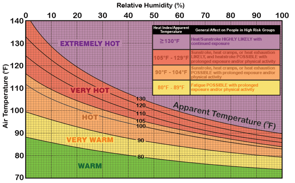
The heat index, then, tells you an estimate of the temperature it would have to be for your body to be similarly stressed in “normal” humidity conditions of around 20%. In New Orleans this week, for example, the temperature on the thermometer isn’t expected to be above 100°F, but because the humidity is so high, the heat toll on the body will be as if it were actually 115°F out in normal humidity.
Importantly, the heat index number is calculated as if you were standing in the shade. If you’re exposed to the sun at all, the “feels like” is, of course, actually higher — potentially as many as 15 degrees higher. Someone standing in the New Orleans sun this week might more realistically feel like they’re in 130-degree heat.
 The heat index graph.NOAA
Here’s the catch, though: The heat index is “purely theoretical since the index can’t be measured and is highly subjective,” as meteorologist Chris Robbins explains. The calculations are all made under the assumption that you are a 5’7”, 147-pound healthy white man wearing short sleeves and pants, and walking in the shade at the speed of 3.1 mph while a 6-mph wind gently ruffles your hair.
Wait, what?
I’m glad you asked.
The long version
In 1979, a physicist named R. G. Steadman published a two-part paper delightfully titled “The Assessment of Sultriness.” In it, he observed that though many approaches to measuring “sultriness,” or the combined effects of temperature and humidity, can be taken, “it is best assessed in terms of its physiological effect on humans.” He then set out, with obsessive precision, to do so.
Steadman came up with a list of approximately 19 variables that contribute to the overall “feels like” temperature, including the surface area of an average human (who is assumed to be 1.7 meters tall and weigh 67 kilograms); their clothing cover (84%) and those clothes’ resistance to heat transfer (the shirt and pants are assumed to be 20% fiber and 80% air); the person’s core temperature (a healthy 98.6°F) and sweat rate (normal); the effective wind speed (5 knots); the person’s activity level (typical walking speed); and a whole lot more.
Here’s an example of what just one of those many equations looked like:
 One of the many equations in “The Assessment of Sultriness: Part I,”R.G. Steadman
Needless to say, Steadman’s equations and tables weren’t exactly legible for a normal person — and additionally they made a whole lot of assumptions about who a “normal person” was — but Steadman was clearly onto something. Describing how humidity and temperature affected the human body was, at the very least, interesting and useful. How, then, to make it easier?
In 1990, the National Weather Service’s Lans P. Rothfusz used multiple regression analysis to simplify Steadman’s equations into a single handy formula while at the same time acknowledging that to do so required relying on assumptions about the kind of body that was experiencing the heat and the conditions surrounding him. Rothfusz, for example, used Steadman’s now-outdated calculations for the build of an average American man, who as of 2023 is 5’9” and weighs 198 pounds. This is important because, as math educator Stan Brown notes in a blog post, if you’re heavier than the 147 pounds assumed in the traditional heat index equation, then your “personal heat index” will technically be slightly hotter.
Rothfusz’s new equation looked like this:
Heat index = -42.379 + 2.04901523T + 10.14333127R - 0.22475541TR - 6.83783x10⁻³T 2 - 5.481717x10⁻²R 2 + 1.22874x10⁻³T 2R + 8.5282x10⁻⁴TR2 - 1.99x10⁻⁶T 2R 2
So much easier, right?
If your eyes didn’t totally glaze over, it actually sort of is — in the equation, T stands for the dry bulb temperature (in degrees Fahrenheit) and R stands for the relative humidity, and all you have to do is plug those puppies into the formula to get your heat index number. Or not: There are lots of online calculators that make doing this math as straightforward as just typing in the two numbers.
Because Rothfusz used multiple regression analysis, the heat index that is regularly cited by the government and media has a margin of error of +/- 1.3°F relative to a slightly more accurate, albeit hypothetical, heat index. Also of note: There are a bunch of different methods of calculating the heat index, but Rothfusz’s is the one used by the NWS and the basis for its extreme heat alerts. The AccuWeather “RealFeel,” meanwhile, has its own variables that it takes into account and that give it slightly different numbers.
Midday Wednesday in New Orleans, for example, when the ambient air temperature was 98°F, the relative humidity was 47%, and the heat index hovered around 108.9°F, AccuWeather recorded a RealFeel of 111°F and a RealFeel Shade of 104°F.
You might also be wondering at this point, as I did, that if Steadman at one time factored out all these variables individually, wouldn’t it be possible to write a simple computer program that is capable of personalizing the “feel like” temperature so they are closer to your own physical specifications? The answer is yes, although as Randy Au writes in his excellent Substack post on the heat index equation, no one has seemingly actually done this yet. Math nerds, your moment is now.
The simplest definition of the “wet-bulb” temperature
Because we’re Americans, it is important that we use the weirdest possible measurements at all times. This is probably why the heat index is commonly cited by our government, media, and meteorologists when communicating how hot it is outside.
But it gets weirder. Unlike the heat index, though, the “wet-bulb globe temperature” (sometimes abbreviated “WBGT”) is specifically designed to understand “heat-related stress on the human body at work (or play) in direct sunlight,” NWS explains. In a sense, the wet-bulb globe temperature measures what we experience after we’ve been cooled by sweat.
 The Kansas State High School Activities Association thresholds for wet-bulb globe temperature.Weather.gov
The long version
The “bulb” we’re referring to here is the end of a mercury thermometer (not to be confused with a lightbulb or juvenile tulip). Natural wet-bulb temperature (which is slightly different from the WBGT, as I’ll explain in a moment) is measured by wrapping the bottom of a thermometer in a wet cloth and passing air over it. When the air is dry, it is by definition less saturated with water and therefore has more capacity for moisture. That means that under dry conditions, more water from the cloth around the bulb evaporates, which pulls more heat away from the bulb, dropping the temperature. This is the same reason why you feel cold when you get out of a shower or swimming pool. The drier the air, the colder the reading on the wet-bulb thermometer will be compared to the actual air temperature.
Wet bulb temperature - why & when is it used?www.youtube.com
If the air is humid, however, less water is able to evaporate from the wet cloth. When the relative humidity is at 100% — that is, the air is fully saturated with water — then the wet-bulb temperature and the normal dry-bulb temperature will be the same.
Because of this, the wet-bulb temperature is usually lower than the relative air temperature, which makes it a bit confusing when presented without context (a comfortable wet-bulb temperature at rest is around 70°F). Wet-bulb temperatures over just 80, though, can be very dangerous, especially for active people.
The WBGT is, like the heat index, an apparent temperature, or “feels like,” calculation; generally when you see wet-bulb temperatures being referred to, it is actually the WBGT that is being discussed. This is also the measurement that is preferred by the military, athletic organizations, road-race organizers, and the Occupational Safety and Health Administration because it helps you understand how, well, survivable the weather is, especially if you are moving.
Our bodies regulate temperature by sweating to shed heat, but sweat stops working “once the wet-bulb temperature passes 95°F,” explains Popular Science. “That’s because, in order to maintain a normal internal temperature, your skin has to stay at 95°F degrees or below.” Exposure to wet-bulb temperatures over 95°F can be fatal within just six hours. On Wednesday, when I was doing my readings of New Orleans, the wet-bulb temperature was around 88.5°F.
The WBGT is helpful because it takes the natural wet-bulb temperature reading a step further by factoring in considerations not only of temperature and humidity, but also wind speed, sun angle, and solar radiation (basically cloud cover). Calculating the WBGT involves taking a weighted average of the ambient, wet-bulb, and globe temperature readings, which together cover all these variables.
That formula looks like:
Wet-bulb globe temperature = 0.7Tw + 0.2Tg + 0.1Td
Tw is the natural wet-bulb temperature, Tg is the globe thermometer temperature (which measures solar radiation), and Td is the dry bulb temperature. By taking into account the sun angle, cloud cover, and wind, the WBGT gives a more nuanced read of how it feels to be a body outside — but without getting into the weeds with 19 different difficult-to-calculate variables like, ahem, someone we won’t further call out here.
Thankfully, there’s a calculator for the WBGT formula, although don’t bother entering all the info if you don’t have to — the NWS reports it nationally, too.


 The heat index graph.
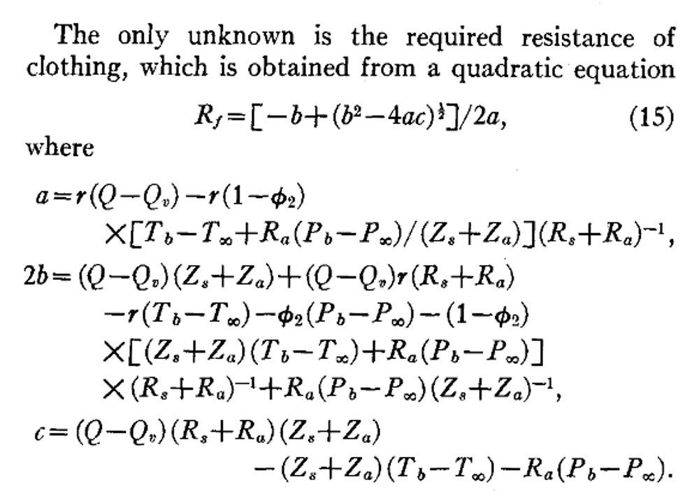 One of the many equations in “The Assessment of Sultriness: Part I,”
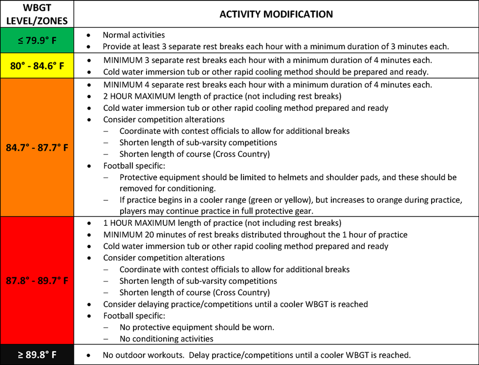 The Kansas State High School Activities Association thresholds for wet-bulb globe temperature.


 The startup team observes the test reactor at the Idaho National Lab. Clean Core Thorium Energy