Peakers are the backup power sources operators run only when demand is at its highest, such as during a heat wave. Peakers are also “probably the dirtiest and most expensive energy on the grid,” Abbe Ramanan, who leads the Phase Out Peakers project at the nonprofit Clean Energy Group, told me. “They tend to burn dirtier fuels, such as oil, and typically have older and less efficient emissions control systems.”
Some 63 million Americans live within a three-mile radius of a peaker, according to a 2023 Clean Energy Group report, where they face health conditions including “significant … increases in estimated rates of hospitalization for asthma, acute respiratory infection, and chronic obstructive pulmonary disease,” all conditions associated with proximity to fossil fuel-fired plants. On top of that, historic redlining practices mean two-thirds of peakers are located in communities with a higher percentage of low-income households than the national average, according to the group’s reporting. And yet peakers also provide life-saving power and AC when a blackout could mean death, such as during last week’s heat wave on the East Coast, making them simultaneously a menace and necessity to maintaining public health, at least with our current grid.
What exactly is peaker plant pollution? How does it appear in the Air Quality Index you might see on your phone? And how do local regulators consider pollution when issuing air quality forecasts? I set out to get answers.
What is peaker plant pollution?
To understand peaker plant pollution, let’s start with a refresher on how air quality alerts work.
The AQI scale runs from 0 to 500 and reflects the local concentrations of five major pollutants: particulate matter, ozone, carbon monoxide, sulfur dioxide, and nitrogen dioxide. Each pollutant has an Environmental Protection Agency-regulated benchmark for what is safe (many of which are set at levels clean air advocates argue are too lax). As concentrations increase, the overall AQI rises to warn first “sensitive groups” and then the general public when to take precautions, such as limiting outdoor activity or wearing a mask. (To learn more about the AQI scale, read my colleague Emily Pontecorvo’s explainer here.)
As do all fossil fuel power plants, peakers release planet-warming carbon dioxide as a byproduct of combustion, along with nitrogen oxides, particulate matter, volatile organic compounds, and other trace toxins that aren’t captured in the AQI, such as heavy metals. Oil and coal-fired power plants also release sulfur dioxide, which creates acid rain; natural gas-fired plants, on the other hand, emit comparatively little.
While NOx is an irritant in its own right, it is, more significantly, a key ingredient in the chemical reaction that creates ozone. When NOx mixes with volatile organic compounds — found in vehicle exhaust, personal care products, and yes, also power plant emissions — on a warm, sunny day, the chemical reaction creates ground-level ozone, which is corrosive enough to scar lung tissue with repeated, prolonged exposure. An expert once helpfully likened it to me as “sunburn on your lungs.” Health researchers have determined that, globally, ozone (also known as smog) causes a million premature deaths every year.
Does peaker plant pollution rise on hot days?
Yes, although it’s not an easy or neat measurement.
Peaker plants are used to rapidly supply electricity to the grid when demand exceeds the baseload capacity. As a result, they run infrequently — only about 5% of the year, or 464 hours per plant, in 2022, per Clean Energy Group’s analysis of 2022 EPA data. Using a stricter definition of peakers, the Government Accountability Office found that the plants represent nearly a fifth of the nation’s potential generating capacity but produce only about a 30th of its overall electricity, mostly due to the time they spend sitting idle.
Power plants use a number of emission control systems to limit emissions of various pollutants. But the EPA has much looser requirements for low-operating peakers, which “may not have effective, if any, emissions control technology,” the GAO writes. When operational, peakers emit an estimated 60 million tons of CO2 per year, with a median NOx emission rate about 6.1 times greater per unit of electricity generated by natural gas-fueled peakers compared to non-peaker gas plants.
“One really big issue with peakers is the emissions control systems are not operating during times when the plant is starting up or shutting down, which means that emissions are just unabated during those times,” Ramanan told me. “And because those plants tend to operate in short bursts, such as during a heat wave, they will start up and shut down more frequently.” Even up to a day beforehand, when the plant is running its test cycle, it might be emitting pollutants even while not actually providing any power.
One 2017 study by University of Wisconsin–Madison researchers found that across the Eastern U.S. from 2007 to 2012, total electricity generation rose by about 4% for every 1-degree Celsius (1.8-degree Fahrenheit) increase in daily summer temperature, with NOx correspondingly up 3.6% and CO2 up 3.3%. Though these numbers aren’t peaker-specific, the plants represent a disproportionate share of the rise since they’re reserved for the hottest, heaviest-load days.
Though the slower rise in NOx suggests “slightly cleaner plants … on average,” the authors write, that is “not completely unexpected, as new natural gas plants are required to have controls installed even as some peaking plants do not.” They note, however, that their data does not fully capture grandfathered-in units, since gas- and oil-fired peakers are allowed non-direct-measurement reporting.
In fact, in Maine and Connecticut, which “use more petroleum for electricity generation than most states in the U.S., primarily as peaking plants deployed on the hottest days,” NOx jumped 33% and 23% per degree Celsius, respectively. Separately, a 2016 study found that peaking plants may have accounted for up to 87% of local particulate matter in the PJM Interconnection during a July 2006 heat wave.
How bad is it?
Peaker plant pollution is significant enough that chronic exposure in local communities has measurable health impacts. But how does it factor into summer AQI levels?
My colleague Matthew Zeitlin spoke this week with Margaret LaFarr, the New York State Department of Environmental Conservation’s director of air resources, who told him that peaker plant pollution is “one of the factors we consider” in formulating its air quality forecasts. But because the state’s agency uses modeling to predict when and where air quality will be poor, the granularity of a single peaker just isn’t there. “If we have to have specific information on the emissions, it would not be ready in time for a timely advisory,” LaFarr said.
Ramanan, whose nonprofit has diligently recorded the negative impacts of peakers, concurred that it is “difficult to pinpoint just how much peaker plants contribute to local air pollution because those sorts of studies are just very expensive to do.” Studies that look at disproportionate health impacts, on the other hand, are a little simpler to put together.
Additionally, while the AQI might rise locally near peakers during a heat wave, because of the nature of the scale, it can’t neatly distinguish why. A high ozone reading, for example, might just as easily be due to tailpipe emissions on a hot day; in the New York metro area, vehicles are responsible for an estimated 60% of the air pollution. Meteorological conditions — whether it’s sunny, a key factor in ozone formation, or which way the wind is blowing — obscure the picture. Particulate matter readings could be from a peaker, for example, but they could just as easily be from wildfire smoke.
One way air quality activists like to think about peaker pollution is as a co-occurrence — that is, a compounding pollution on top of already degraded conditions. Hot days tend to be the worst for ozone already, because of the aforementioned tailpipe pollution; peakers, activated to help with the heat-related energy load, then release more ozone-generating emissions at the worst possible time.
While a precise breakdown of the AQI might not be there for peakers, “we know the days that are more conducive to ozone formation generally tend to be those same days where people are cranking up their ACs and there is a higher demand for energy,” LaFarr said.
Could a cleaner fuel reduce emissions?
There is some speculation that cleaner input fuels could help reduce the worst peaker plant emissions. Generally, this is true: The 2017 study by the University of Wisconsin–Madison researchers found that from 1997 to 2015, in Texas, petroleum use in electricity generation dropped 85% and coal dropped 12%, while natural gas increased 57%. As a result, Texas had the lowest level of SO2 sensitivity of any state.
But beyond the existing fuel mixes, fuel switching is not a clean fix for peaker plants. “Burning things like hydrogen and [methane captured from waste processing facilities] don’t actually reduce the air pollution burden in any meaningful way,” Ramanan argued. “Hydrogen in particular tends to actually have extremely high levels of NOx emissions when it’s combusted.”
In Astoria, a neighborhood of New York City, activists opposed retrofitting the local oil-powered peaker plant to run on natural gas because doing so would “lock the state into relying on fossil fuels for decades, fly in the face of the state’s climate law that requires a drastic reduction in carbon emissions by mid-century and continue to pollute in an already overburdened community where many residents are immigrants and live below the poverty line,” Inside Climate News reported. At the same time, doing so would “reduce the state’s greenhouse gas emissions by more than 5 million tons through the year 2035,” per its owner, NRG Energy.
But a third way emerged: New York eventually denied NRG’s permit because it violated the state’s climate law, and the utility subsequently sold the Astoria facility to serve as the converter station for Beacon Wind, a development off the coasts of New York and Massachusetts.
While wind, new transmission, and battery storage all face enormous headwinds in the current political climate — meaning that many peaker plants targeted by activists for retirement are likely to stick around for years yet — advocates remain adamant that a playbook exists for decarbonization. “In terms of replacing one-to-one capacity, we’ve been looking at battery storage even just at peaker plant sites that can be paired with renewables or grid connected batteries,” Ramanan said, adding that “really great work is also being done in terms of virtual power plants and demand reduction — because it’s not just about reducing peak capacity, it’s also reducing the peak overall.”
Is running a peaker plant “worth it” for reliable AC?
That raises a final, particularly thorny question: Is air pollution from peaker plants “worth it” if it means being able to run AC?
A 2018 follow-up study by the same team of researchers at the University of Wisconsin–Madison explored a similar question. They found that climate change alone would increase summer mortality related to the smallest airborne particulate pollution by more than 13,500 deaths, and ozone-related mortality by more than 3,500 deaths in a mid-century scenario. AC-driven power sector emissions — full-fleet numbers, albeit disproportionately including peakers — would, on top of that, account for 654 PM 2.5 deaths and 315 ozone deaths, a nearly 5% and 9% increase, respectively, over climate impacts alone.
Researchers credit access to air conditioning in the United States with a 75% decline in deaths, and modeling exercises frequently show that a blackout during a heat wave could realistically result in hundreds of thousands of people needing medical attention. But clean air advocates also point to examples like Astoria, where the denial of a permit to retrofit a peaker plant for slightly better fossil fuels resulted in the grounds being used for a renewable energy source instead.
It’s certainly not an easily replicable process given the current political and economic climate, but it also perhaps suggests a false dichotomy of peakers vs. AC. Affordable power and livable spaces are just two among a host of community needs energy and public health officials must keep in mind.
“It’s not enough to just replace the existing system with renewables and battery storage and have fewer emissions,” Ramanan said. “It also has to be equitable, because otherwise we’re just going to replicate the same issues we’re having now in different ways.”


 IEA
IEA IEA
IEA IEA
IEA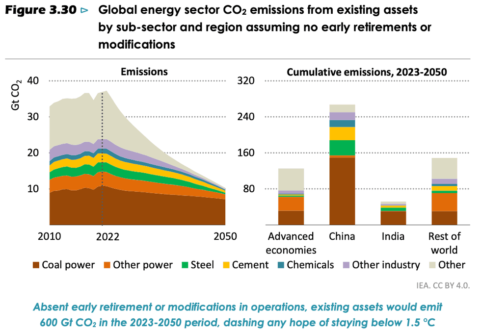 IEA
IEA IEA
IEA IEA
IEA IEA
IEA


 The view Monday in front of a coffee shop in Nice, France. Valery HACHE / AFP via Getty Images